General
How to Create a Personalised Thanksgiving E-Card
Make a Thanksgiving e-card from your own family photos in twenty minutes, with three layouts, the right sizes, and how to send it properly.
A generic e-card takes ten seconds to make and ten seconds to delete. A card with your actual family on it gets saved, forwarded and mentioned at dinner.
The difference is one technique — cutting your family out of a photo so you can put them somewhere designed — and about twenty minutes. Here is how.
Cut your family photo out of its background →
What you need
- One family photo you like.
- A browser.
- Any free design tool for layout.
No design experience, no subscriptions, no software installs.
Step one: choose the right photo
This decides how good the card looks, more than anything you do afterwards.
Look for:
- Everyone’s face visible and reasonably sharp.
- Space around the group — you will need room to crop.
- Even light. Outdoors on an overcast day is ideal.
- Some separation between the group and whatever is behind them.
Avoid:
- Photos taken at night with a flash — harsh shadows are hard to cut around.
- Anyone half-hidden behind someone else.
- A background exactly the same colour as someone’s clothing.
If your best group photo does not exist, take one now. Prop the phone on a shelf, use the timer, stand near a window. Three minutes.
Step two: make the cutout
This is the step that turns a snapshot into a card element.
- Open the background remover.
- Drop your photo in.
- The people are separated from the background automatically.
- Check the edges, particularly hair and the gaps between people.
- Download as a PNG — this keeps the transparency.
Our free preview runs entirely inside your browser. For family photos, and especially photos of children, that matters: the image never leaves your device during the preview.
If the cutout has rough spots
- Gaps between people not removed? Use the brush to erase them.
- Hair looking chewed? Brush a little back in around the outline.
- A faint white halo? Preview it on a dark colour to check, and tighten the edge if you see one.
Step three: build the card
Three layouts, in order of effort.
Layout A: cutout on a colour
Time: 10 minutes. The simplest and hardest to get wrong.
- Make a canvas 1200 × 1500 pixels.
- Fill it with a warm autumn colour — burnt orange, deep rust, olive, or a muted cream.
- Place your cutout large, filling most of the lower two thirds. Let it run off the bottom edge.
- Add a greeting across the top: “Happy Thanksgiving from the Hendersons”.
- Add a soft, wide shadow under the group so they sit on the card rather than float above it.
Colour tip: pull a colour from someone’s clothing in the photo and use a darker version of it as the background. It will always look coordinated.
Layout B: cutout on a texture
Time: 15 minutes. A step up, still easy.
Instead of a flat colour, use a background with subtle texture — kraft paper, linen, a soft autumn gradient, or an out-of-focus photo of leaves.
The rule: the texture must be quiet. If it competes with the faces, blur it or fade it toward one colour. A background at 30% opacity over a flat colour is usually the right balance.
Layout C: family placed in a scene
Time: 20 minutes. The one people remember.
Put your family somewhere they were not — an autumn wood, a farmhouse table, an absurdly grand dining hall.
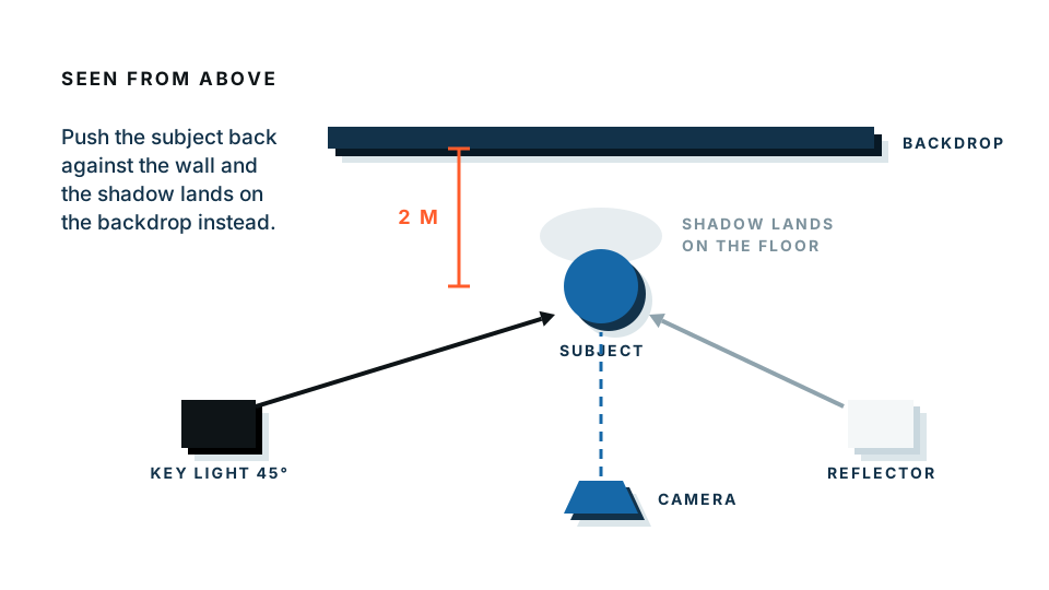
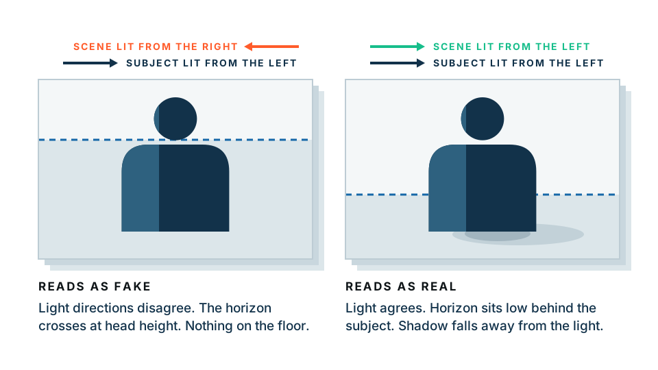
Use the background changer and follow one rule above all others: match the light direction. If your family was lit from the left, choose a background that is brighter on the left. This single detail is what separates a composite that reads as real from one that reads as a school project.
Also match the scale and the camera height. People photographed at eye level look wrong dropped into a scene shot from above.
Put your family in a new scene →
Step four: the words
Keep it short. An e-card is read in about two seconds.
Structure that works:
- A greeting line, large: “Happy Thanksgiving”
- Who it is from, smaller: “from the Hendersons — Mark, Ana, Theo and Rosa”
- One personal line, optional: “Grateful for you this year.”
Typography rules:
- One font, two sizes. If you must use two fonts, make them very different from each other.
- High contrast between text and background. Cream on rust, not orange on brown.
- Leave generous empty space around the text. Crowding is what makes homemade cards look homemade.
Step five: sizes and exporting
| Use | Size | Format |
|---|---|---|
| 1200 × 1500 px | JPG, under 1 MB | |
| Messaging apps | 1080 × 1350 px | JPG |
| Social post | 1080 × 1080 px | JPG |
| Printed 5×7 card | 1500 × 2100 px at 300 DPI | PDF or high-quality JPG |
| Printed A6 card | 1240 × 1748 px at 300 DPI |
Export as JPG for anything digital. PNG files are much larger and the transparency is no longer needed once the card is assembled.
Step six: sending it well
In email: attach the JPG and embed it in the body. Some clients show attachments inline, some do not. Write two lines of text above it — a card with no message reads as a mass send.
In messaging apps: send the image on its own, then the message separately. It displays larger that way.
Personalising per recipient: build the card once, then change only the greeting line and export a new copy for each family. Ten versions takes about five minutes and the effect is out of all proportion to the work.
Making a set
If you enjoy this, make three or four variations at once — different photos, same colours and fonts. Send different ones to different groups. Because the styling is consistent, the set looks like a deliberate family thing rather than four separate attempts.
Common mistakes
Too much text. Two lines is plenty. Save the news for the message body.
A cutout floating in the middle. Let it overlap the text, or run off an edge.
Low resolution. If you built it at 600 pixels wide, it will look soft on any modern screen. Start at 1200 minimum.
Muddy colours. Autumn palettes drift toward brown. Keep one bright accent — a warm gold, a deep red — so the card does not look like mud.
Sending a PDF. Nobody opens them. Send an image.
Start with the photo
Pick the family photo you already like. Cut it out. Put it on a warm colour. Add one line of text. If you do nothing else, that is a genuinely good card, and it took twenty minutes.
Frequently asked
What size should a Thanksgiving e-card be?
1200 by 1500 pixels covers email and messaging well. For a card you also want to print, work at 300 DPI — 1500 by 2100 pixels for a 5 by 7 inch card.
Should I send an e-card as an image or a PDF?
As a JPG image. It displays inline in email and messaging apps. A PDF requires a download, and many people will not bother.
How do I put my family on a nice background?
Remove the background from your family photo to get a transparent cutout, then place it on an autumn colour, a texture or a new scene. Cutouts are what make a homemade card look designed.
Can I make one card and personalise it for different people?
Yes. Build the card once, then change only the greeting line for each recipient and export a copy. Ten personalised versions take about five minutes.
Is it safe to use family photos in an online editor?
Our free preview processes images entirely in your browser, so family photos are never uploaded. Check any other tool's privacy policy before uploading photos of children.