General
How Digital Media Outlets Can Use AI Background Removal
Newsrooms ship hundreds of images a day. Where automatic background removal saves real time, and where editorial standards say do not touch.
A modern publisher ships more images than articles. Every story needs a lead image, a social card, sometimes a video thumbnail, sometimes a newsletter header — each at a different size and shape. A picture desk that once handled a print edition now handles a rolling stream.
Automatic background removal helps with a specific slice of that work, and is completely wrong for another slice. Knowing which is which is the whole skill. This guide covers where it saves real time, where editorial standards say do not touch, and how to keep a team’s output consistent.
Quick summary: cutouts belong in designed graphics — social cards, thumbnails, explainers, panels. They do not belong in documentary photographs. Decide the rules once and put them in the template.
Working on a graphic right now? Cut out your subject here — the free preview runs entirely in the browser, which matters when the image is embargoed.
The line that must not move
Start here, because it governs everything else.
A news photograph is evidence. Its value comes from being an accurate record of a moment. Removing a background changes what the reader is being told — it deletes context, it can change who appears to be present, and it can make a small gathering look like a large one or the reverse. Every serious editorial code prohibits it, and audiences that discover it lose trust permanently.
A designed graphic is an illustration. A social card with a politician cut out beside a headline is obviously a made object. Nobody reads it as a photograph of a scene. Cutouts are entirely appropriate here.
The practical test: would a reasonable reader believe this image is a photograph of something that happened? If yes, do not alter it. If it plainly reads as a designed asset, you have room to work.
A middle case worth naming: archive and file photos used as illustration. A cutout of a public figure from a file photo, placed in a panel, is standard practice. It becomes a problem when the composite implies a meeting, an event or a relationship that did not occur. The tool is fine; the composition can still mislead.
Where it genuinely saves time
Social cards
Every story gets one, and it must work at thumbnail size on a feed. A cutout subject against a flat brand colour reads at 200 pixels wide where a full photograph does not. This is the highest-volume use case in most newsrooms.
Video thumbnails
Click-through on video is dominated by the thumbnail, and the reliable pattern is a clear subject, a strong background and a few words. Cutting the subject out lets you place the text without covering a face.
Explainer and data graphics
An explainer about energy prices needs a cut-out meter, a cut-out house, a cut-out pylon. Sourcing those as pre-cut stock is slow. Cutting them from ordinary photographs takes seconds.
Sports and election panels
Head-to-head layouts, league tables with player faces, constituency panels with candidate portraits. These need dozens or hundreds of consistent cutouts on a deadline, which is exactly what automation is for.
Newsletter headers and section furniture
Recurring templates where the subject changes weekly but the layout does not.
Vertical and square crops
A landscape photo does not become a good vertical by cropping. Cutting the subject out and re-placing them on a vertical canvas keeps the composition intentional. This is more work than a crop and produces a far better result for a story that matters.
The workflow for a busy desk
1. Decide the rules once
The biggest cost in a newsroom is not the cutout — it is fifteen people making fifteen slightly different decisions. Write down:
- Canvas sizes for each output: social card, thumbnail, header, panel
- How much margin around the subject, as a percentage
- Where the subject sits: left third, centre, bottom-aligned
- Edge treatment: hard cutout, soft fade, or a keyline
- Shadow: none, or a defined drop shadow with fixed values
- Background: brand colour, gradient, or blurred original
- File format and maximum file size
2. Build it into the template
Whatever the CMS or design tool, the rules should live in a template, not in someone’s memory. The person under deadline should be dropping a cutout into a slot, not making design decisions at 11pm.
3. Cut out and check
The check takes ten seconds and prevents most published errors:
- Hair and headwear. The most common failure, and the most visible.
- Microphones and held objects. Frequently trimmed, and their absence is odd in a press-conference image.
- Glasses. Frames survive; lens reflections can behave strangely.
- Crowd edges. If two people overlap, automatic detection may take both or split one.
4. Keep a transparent master
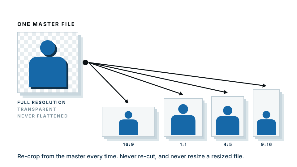
Save the cutout as a transparent PNG once, then reuse it across every size. Re-cutting the same subject for each output is the hidden time sink.
Need the master cutout? Make it here — free preview in the browser, no upload, which is the sensible default for anything under embargo.
The privacy and embargo angle
This deserves attention in a newsroom specifically.
Most online tools upload your image to a server to process it. For a stock photo of a wind turbine, irrelevant. For an embargoed product image, an unpublished exclusive, a picture from a source, or an image involving a minor with reporting restrictions, it is a genuine editorial risk — and one that rarely appears on anyone’s checklist.
Our free preview processes the image entirely inside the browser. The file never leaves the machine. That is a meaningful difference for pre-publication material, and no other major tool in this category offers it. To be straight about the limits: the paid full-resolution download is processed on our server, so for the most sensitive material, use the local preview to check the cutout and handle the final file according to your own desk policy.
Licensing: check before you cut
Technical capability is not permission. Common restrictions:
| Source | Typical position on alteration |
|---|---|
| Wire agencies | Cropping and tonal correction only; alteration prohibited |
| Rights-managed stock | Depends on the specific licence; often restricted |
| Royalty-free stock | Usually permitted, but read the terms |
| Handout and PR images | Usually supplied for use as-is |
| Staff photography | Your own rules apply |
| Creative Commons | Depends on the licence; some prohibit derivatives |
The rule that keeps a desk out of trouble: the licence governs, not the tool. If nobody on the desk knows the terms for a given image, that is the question to answer before anything else.
Accessibility and captions
Two things get forgotten in cutout workflows.
Alt text. A cutout still needs a description. Describe what is shown, not that it is a cutout: “The chancellor speaking at a lectern”, not “cut-out image of the chancellor”.
Photo credit. Removing the background does not remove the photographer’s credit. If the original required attribution, the derived graphic does too. Build a credit line into the template so it cannot be skipped.
Measuring whether it is worth it
If you are arguing for a tool or a change in process, the numbers that matter:
- Minutes per asset, before and after. A manual cutout of a person is five to fifteen minutes. Automatic plus a check is under one.
- Assets per story. Multiply. A desk producing four assets per story across forty stories a day is doing 160 cutouts.
- Time to publish. For breaking news, the graphic arriving twenty minutes earlier is worth more than its production cost.
- Consistency complaints. Harder to count, but a brand that looks assembled by one team performs better than one that does not.
A short list of things not to do
- Do not cut out subjects from news photographs presented as documentary.
- Do not composite two people into an image implying they were together.
- Do not remove someone from a group photograph.
- Do not use a cutout in a way that changes the apparent scale of a crowd or event.
- Do not alter images you do not have rights to alter.
- Do not skip the edge check because the deadline is tight. Published errors last longer than late graphics.
Getting started this week
Pick one recurring asset — the social card is the obvious candidate. Define its rules, build the template, and run a week of stories through it. Measure the time. Then extend to thumbnails, then panels.
Start with one cutout and see how it fits your desk. The preview is free, runs locally, and takes seconds.
Frequently asked
Is it acceptable to remove the background from a news photograph?
Not for reportage. Editorial standards treat news photographs as evidence, and altering them misleads readers. Cutouts belong in illustration, promotion and graphics, clearly separated from documentary images.
Where does background removal genuinely help a publisher?
Social cards, video thumbnails, explainer graphics, sports and election panels, newsletter headers, and any composite that is clearly designed rather than photographed.
How do publishers keep cutouts consistent across a team?
Fix the rules once — canvas size, margin, edge treatment, shadow, file format — and write them into the CMS templates so the decision is made in the template, not by each editor.
Does background removal work on archive photographs?
Often, yes. Older scans and low-resolution wire photos are harder because the edges are soft, but the automatic result is usually a better starting point than a manual selection.
What about images we do not have rights to alter?
Licence terms frequently restrict modification, particularly for agency and wire images. Check the licence before cutting anything out, regardless of what the tool can do.