General
How to Create a Podcast Cover That Works at Any Size
Design a podcast cover that reads at 55 pixels, meets Apple and Spotify specs, and looks professional, using your own photo and free tools.
Your cover art has one job: be recognisable at 55 pixels wide in a list of forty other shows. That is smaller than the full stop at the end of this sentence at reading distance.
Almost every bad podcast cover fails for the same reason — it was designed at 3000 pixels and never once looked at small. Everything below follows from fixing that.
Cut your photo out for the cover →
The specifications
Get these right first, because a beautiful cover at the wrong size gets rejected.
| Requirement | Value |
|---|---|
| Dimensions | 3000 × 3000 px (min 1400 × 1400) |
| Shape | Perfect square |
| Format | JPG or PNG |
| Colour space | RGB, not CMYK |
| File size | Under 512 KB where possible |
| Resolution | 72 DPI is fine — it is a screen image |
Apple Podcasts sets the standard most directories follow. Spotify, YouTube Music and the rest accept the same file. Make it once at 3000 × 3000 and you are done everywhere.
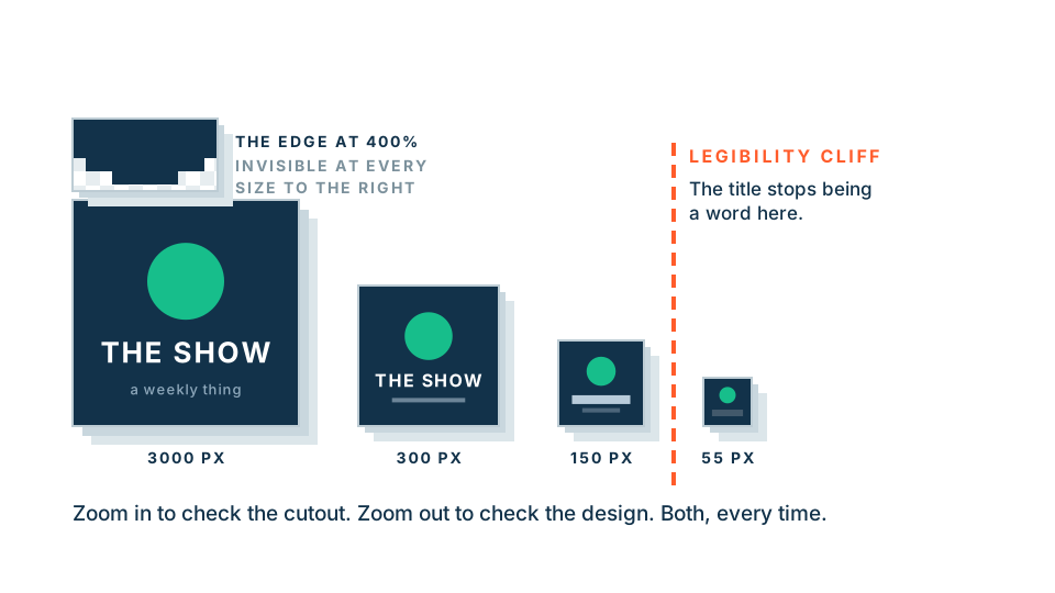
Where it actually gets displayed:
- 3000 px — almost never
- 300 px — show page
- 150 px — search results
- 55 px — now-playing bars and list views
Design for 55. Check at 3000.
The one rule that governs everything
Three elements maximum.
- A shape or image.
- The show name.
- A background colour.
That is it. Every extra element — a tagline, your name, a URL, an episode count, a microphone icon, a border — makes the cover worse at 55 pixels. Podcast covers are not posters. They are icons.
Step one: pick your approach
There are three that reliably work.
Approach A: face on flat colour
Best for: interview shows, solo shows, anything built around a person.
A cut-out photo of a face on a single bold colour. It works because faces are the thing human eyes are best at recognising at small sizes, and flat colour gives you clean space for type.
Approach B: bold type only
Best for: shows with a short, distinctive name.
The show name at enormous size, filling the square, in one heavy typeface on one colour. No image at all. This is the most under-used approach and it is nearly impossible to get wrong.
If your show name is more than three words, this is harder. Two words is ideal.
Approach C: one simple symbol
Best for: topic-led shows where a single object represents the subject.
One graphic shape — not a detailed illustration — plus the name. Think a single silhouette, not a scene.
What does not work: a photo of a microphone, a stock photo of headphones, a busy scene, or a photograph with the name written across it in a script font.
Step two: make the cutout (if you are using a photo)
A photo with its background still attached will not read small — the subject and the surroundings turn into one grey mush. Cutting the subject out and placing it on flat colour is what preserves the silhouette.
- Take or choose a portrait. Shoulders up, good light, a clear expression. A neutral or plain background helps but is not required.
- Open the background remover and drop the photo in.
- Check the hair edge — this is where cutouts fail.
- Download as PNG.
Our free preview processes the image entirely in your browser, so nothing is uploaded.
Making the cutout look designed
- Crop close. Head and shoulders, not full body. At 55 pixels a full body is a smudge.
- Place it off-centre. A face slightly to one side with the name filling the other half is a stronger composition than a centred face with the name below.
- Let it break the edge. Have the shoulders run off the bottom of the square.
- Add a subtle shadow or a coloured rim behind the subject to separate it from the background colour.
Make your transparent cutout →
Step three: colour
One background colour. Pick it for contrast, not for taste.
Open a podcast app and look at the chart in your category. If everything is dark blue and black — and in most categories it is — choose something else. Bright yellow, orange, deep green, cream. The most valuable property of a cover is not being the same as its neighbours.
Practical guidance:
- Use one dominant colour and one accent, maximum.
- Ensure your text has strong contrast against the background. Dark text on light, or light on dark. Nothing in between.
- Avoid gradients that go light-to-dark behind text — the text will be readable at one end and invisible at the other.
- Test in both light and dark app themes. Some apps put a border around covers, some do not.
Step four: type
The show name, and almost nothing else.
- Heavy weights only. Bold, Black, Extra Bold. Thin fonts disappear at small sizes.
- Big. Bigger than feels right. The name should occupy at least a third of the square.
- Sans-serif for legibility. Serifs get muddy small.
- Two lines maximum. Break the name across lines rather than shrinking it.
- Tight line spacing when stacking words. Loose spacing wastes the square.
- No effects. No outer glow, no bevel, no long shadow, no outline.
If your show name is genuinely long, consider whether the cover should carry a shortened version. Plenty of shows do this and nobody minds.
Step five: the 55-pixel test
This is the step that separates good covers from bad ones, and it takes thirty seconds.
- Export your design.
- Shrink it to 55 pixels wide on screen.
- Look at it from normal viewing distance.
Ask:
- Can you tell what the main shape is?
- Is any text readable?
- Would you recognise it in a list a week from now?
If the answer to any is no, remove something and try again. It is always removal, never addition.
Also check it in greyscale. If it falls apart without colour, the composition is relying on colour alone.
Common mistakes
| Mistake | Why it fails | Fix |
|---|---|---|
| Small text | Invisible below 150 px | Make the name three times bigger |
| Photo with background | Turns to mush small | Cut the subject out |
| Four or more elements | Nothing dominates | Cut to three |
| Thin or script fonts | Strokes vanish | Use a heavy sans-serif |
| Dark on dark | No contrast | High contrast only |
| A microphone graphic | Everyone has one | Say what the show is about instead |
| CMYK colour | Colours shift in apps | Export RGB |
| Text near the edges | Some apps round corners | Keep a 10% safe margin |
Updating it later
You can change cover art whenever you like — directories pick up the new file from your feed, though caching means it can take a day or two to appear everywhere.
If you do redesign, keep the colour. Listeners recognise your show by its colour long before they read the name. Change the layout, keep the palette.
Make one this afternoon
Take a portrait, cut it out, put it on a bright colour, add the show name in the heaviest font you own. Shrink it to 55 pixels. Adjust. Export at 3000 × 3000.
That is a genuinely good podcast cover, and it took an hour.
Frequently asked
What size should podcast cover art be?
3000 by 3000 pixels, square, RGB, saved as JPG or PNG under 512 KB where possible. Apple Podcasts requires between 1400 and 3000 pixels square, and 3000 is the safe maximum.
Why does my podcast cover look bad in the app?
Almost certainly because it was designed at full size and never checked small. Covers display as little as 55 pixels wide in some lists. Shrink your design to 55 pixels and see if it still reads.
Should my podcast cover have my face on it?
If the show is built around you or your guests, yes — faces get attention and build recognition. Cut the face out of its background and place it on flat colour so it reads clearly at small sizes.
How many words should be on podcast artwork?
The show name and nothing else, ideally. A very short tagline can work if the name is short. Never put episode numbers, your name, and a URL on the cover — none of them are legible small.
Do I need a designer?
No. A bold colour, one photo cutout, and the show name in a heavy font will beat most of what is in the charts. Restraint does most of the work.