General
How To Add A Background To A Photo
Put your subject on a new background that actually looks real — matching light, colour and perspective, plus the contact shadow most people forget.
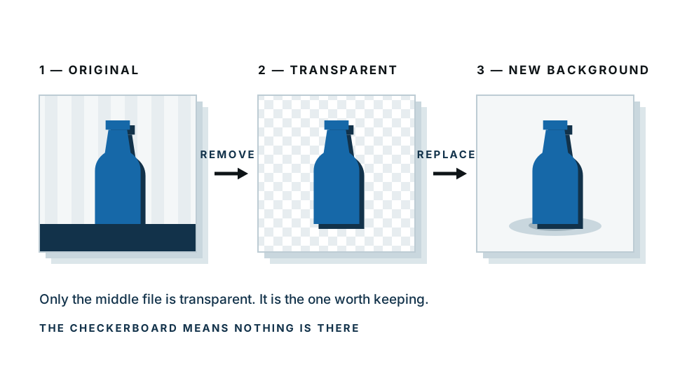
Adding a background is really two jobs, and most guides only tell you about the second one. First you have to separate your subject from whatever is behind it now. Only then can you put something new back there.
That first job used to be the hard part. It is not any more. The interesting part is the second job: choosing a replacement that your eye actually believes.
Quick summary: cut out your subject, pick a replacement that matches the light and colour of the original photo, keep the subject at a sensible size, and add a soft shadow under it. Skip the shadow and it will look pasted on every time.
If you just want it done, our background changer handles the cutout and drops in a new colour or scene in one pass.
Why do you have to remove the old background first?
A photo has no layers. It is one flat grid of coloured pixels — there is no “behind” for a new image to slide into. So the software has to decide which pixels are your subject and which are disposable, then delete the disposable ones. That is the cutout.
Everything after that is composition. Get the cutout wrong and no amount of clever compositing saves it, because the edge is where people look.
What background should you actually choose?
Here is the honest answer most people need: you probably do not want a scene. You want a clean, calm background that makes your subject look deliberate. A solid colour or a soft gradient does that in seconds and looks more professional than a stock photo of an office you have never been in.
Save the full scene replacement for when the scene is the point.
| Background type | Effort | How believable | Best for |
|---|---|---|---|
| Solid colour | Seconds | Always convincing — nobody questions a studio backdrop | Profile photos, product listings, logos, CVs, marketplace shots |
| Soft gradient | Seconds | Very convincing, and adds depth a flat colour lacks | Headshots, team pages, slide decks, thumbnails |
| Blurred photo | A minute | Convincing, because blur hides the mismatches | Video calls, casual portraits, “on location” without the location |
| Full replacement scene | 10+ minutes | Hardest — every mismatch in light and perspective shows | Travel composites, product-in-context shots, creative work |
The rule of thumb: the more detail in your new background, the more chances your eye has to catch something wrong.
How do you make a new background look real?
If you are going for a real scene, four things decide whether it works. In order of how much they matter.
1. Match the direction and hardness of the light
Look at your subject. Which side are the shadows on? Are the shadow edges sharp or soft?
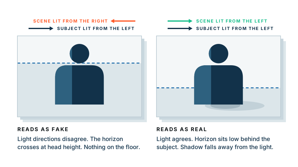
Sharp shadows mean hard light — direct sun, a bare bulb, a flash. Soft, gradual shadows mean diffused light — an overcast day, a window, a big softbox. Put a hard-lit subject into a soft-lit scene and it will look cut out even if the edges are flawless.
Pick a background photographed in similar conditions, and check the shadows fall the same way in both.
2. Match the colour temperature
This is the one that catches everybody. Indoor light is warm — orange and yellow. Daylight and shade are cool — blue. A subject photographed under warm tungsten light, dropped onto a cold blue mountain scene, reads as fake instantly. Your eye knows, even if you cannot name why.
Fix it by warming or cooling one of the two until they agree. Usually you nudge the subject towards the background, because the background sets the mood of the whole image.
3. Match perspective and horizon height
Was the original photo taken at eye level, or looking down, or up? Your background needs the same viewpoint. A shot taken looking slightly down at someone will not sit in a scene photographed from the ground.
The quickest check: find the horizon line in the background. It should cross your subject at roughly the height the original camera was. If the horizon sits at your subject’s knees, the camera was low — so a portrait shot from standing height will not fit.
4. Keep the scale sensible
Easy to get wrong when you are dragging a subject around. Compare against something known in the scene — a doorway is about two metres, a car roof reaches most people’s shoulder.
Once your subject is separated, swapping between options is quick — try a few in our background changer before committing to one.
The step everyone forgets: the contact shadow
A cutout subject with no shadow floats. It is the single clearest giveaway, more than edges, more than colour.
You do not need a full cast shadow stretching across the floor. You need a contact shadow — a small, soft, darker patch right where the subject meets the ground. Feet, wheels, the base of a bottle. That tiny bit of darkness tells your brain the object is resting on something.
To add one: make a soft ellipse beneath the subject, slightly narrower than its base. Fill it with a dark version of the background colour — not pure black, which looks like a hole. Blur it heavily, drop the opacity to somewhere around 20 to 40 percent, and keep it darkest and tightest right at the contact point.
Two minutes, and it does more for realism than anything else on this list.
Step by step: the full workflow
- Start with the best original you have. More pixels and a clear edge between subject and background make everything downstream easier.
- Cut out the subject. Let the automatic cutout do the separation, then check the edges — hair, fur, and anything thin or semi-transparent are the hard cases.
- Decide what you actually need. Solid colour, gradient, blur, or scene. Be honest about whether a scene is earning its keep.
- Place the new background behind the subject. If you are using a scene, position it so the horizon and perspective match.
- Match the light and colour. Adjust warmth first, then brightness, then contrast. Small nudges. If you are pushing hard, the background is probably the wrong choice.
- Check the scale. Compare to something familiar in the scene.
- Add a contact shadow under the subject where it meets the ground.
- Zoom to 100 percent and inspect the edge. Look for a rim of leftover colour from the old background — a bright fringe against a dark new background is the classic tell.
- Export. JPG for a finished flat image. PNG if you want to keep the subject on transparency and reuse it.
A note on privacy
If the photo is a client’s product, an ID photo, or something personal, it matters where the image goes. Our free preview runs entirely inside your browser — the image never leaves your device. The paid full-resolution download is processed on our server, so if that distinction matters to you, it is worth knowing which one you are using.
When it is not worth fighting
Some images will not composite well and it is quicker to accept it than to spend an hour.
- Motion blur. A blurred arm has no clean edge to find, only a gradient.
- Fine flyaway hair against a busy background. There is no correct answer for a pixel that is 40 percent hair and 60 percent bookshelf.
- Glass, smoke, water, veils. Anything you can see through carries the old background inside it. Cut it out and the old colours come along.
- Very small images. If the subject is 200 pixels tall, there is not enough edge information to work with.
For these, a solid colour or a gradient is not a compromise — it is the better result. A clean subject on plain grey looks intentional. A half-melted subject in a stock forest does not.
Ready to swap yours? Start with the background remover to get a clean cutout, then choose your new background from there.
Frequently asked
Can you add a background to a photo without removing the old one first?
No. A photo is a flat grid of pixels, so the new background has nowhere to go until the old one is cut away. Every method starts with separating the subject, even the one-click ones — they just do the cutout for you invisibly.
Why does my new background look fake?
Almost always the light. If your subject is lit from the left by warm indoor light and the new scene is lit from the right by cold daylight, your eye spots it instantly. Match the direction, hardness and warmth of the light before you worry about anything else.
What is the best background colour for a professional photo?
A light neutral grey works for almost everything — it separates the subject without competing. Pure white suits product listings and marketplaces. A soft gradient of one colour looks more expensive than a stock photo scene and takes seconds.
How do I stop my subject looking like it is floating?
Add a contact shadow — a small, soft, slightly darker patch directly beneath where the subject meets the ground. It does not need to be a full cast shadow. Even a faint ellipse at 20 to 30 percent opacity anchors the subject convincingly.
Should I use a blurred photo as a background?
It is a great middle option. Blurring hides the mismatched detail that gives composites away, while keeping believable colour and depth. Use it when a solid colour feels too plain but a full scene is too much work.