Product photography
The Complete Guide to E-Commerce Product Photography
Shoot professional product photos with a window, a sheet of card and your phone, then edit them into a consistent catalogue that converts.
You do not need a studio, a camera, or a photographer. You need a window, a sheet of white card, your phone, and a repeatable process.
This guide covers the whole thing: setup, shooting, editing, and the sizes each platform expects. Everything here can be done at a kitchen table on a Saturday.
Jump ahead to the editing step →
What makes a product photo actually work?
Three things, in order of importance.
Clarity. The buyer can see exactly what they are getting. Nothing distracting, nothing ambiguous, nothing hidden.
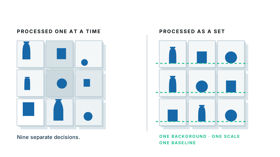
Consistency. Every photo in your catalogue shares the same background, the same crop margin, the same light. This is what makes a shop feel like a shop.
Honesty. The product looks like it will look when it arrives. This is not a moral point, it is a returns-rate point.
Notice that “beautiful” is not on the list. Beautiful helps. Clear, consistent and honest sell.
Part one: the setup
What equipment do I actually need?
| Item | Why | Cost |
|---|---|---|
| A window | Free, soft, flattering light | £0 |
| Two sheets of white A2 card | Background and bounce | A few pounds |
| A phone from the last few years | The camera | Already owned |
| Something to prop the phone on | Stops camera shake | A stack of books |
| Masking tape | Marking product position | £2 |
That is the complete list. A lightbox is a convenience, not a requirement. A ring light is worse than a window.
How do I set it up?
- Pick a north-facing window if you have one — the light is soft and constant. Any window works if the sun is not shining directly through it.
- Turn off every artificial light in the room. Mixing daylight with warm bulbs is the single most common cause of unfixable colour casts.
- Place a table beside the window, side-on so the light comes across the product rather than straight at it.
- Curve one sheet of card from the table up against the wall. The curve removes the horizon line where table meets wall, which is what a “sweep” is.
- Put the product a hand’s width forward of where the card curves up.
- Stand the second card on the shadow side, about a foot away, to bounce light back in.
- Tape a small mark on the table where the product sits, and another where the phone sits. This is how you get consistency across a hundred products.
If your window light is too harsh
Tape a white bedsheet or baking parchment across the window. That is a diffuser. It costs nothing and it is the same thing a softbox does.
Part two: shooting
What camera settings should I use?
On a phone: very few.
- Turn the flash off. Always.
- Tap the product to set focus and exposure.
- Do not use portrait mode for the main shot. Artificial background blur confuses background removal and hides detail.
- Do not zoom with your fingers. Move closer, or use the phone’s dedicated telephoto lens if it has one.
- Shoot in the highest quality setting available.
On a camera, if you have one: aperture around f/8 for full sharpness, ISO as low as it will go, and a tripod so the shutter speed does not matter.
What angles do I need?
Shoot the same set for every product, in the same order. The order matters because it makes the session mechanical rather than creative, and mechanical is how you get through fifty items.
- Hero — straight on, product centred, slightly above its midline.
- Three-quarter — turned 45 degrees, the most natural-looking angle for most objects.
- Back
- Side
- Detail — the texture, the stitching, the material, the thing that justifies the price.
- Scale — next to a hand or a common object.
- Flaw, if the item is used. Photograph it clearly.
- In use — the only shot where the background can be a real room.
The mistakes that cost you the most
Shooting from above. A photo taken looking down at a product on a table makes it look like a snapshot. Get the phone down to the product’s own eye level.
Cropping too tight. Leave space. You cannot add it back later.
Inconsistent distance. If one product fills the frame and the next is tiny, your grid will look broken.
Shooting at night. Everything will be yellow and grainy. Wait for daylight. It is free.
Dirty products. Zoom shows dust, fingerprints and lint that your eyes skipped over. Wipe everything before you shoot.
Part three: editing
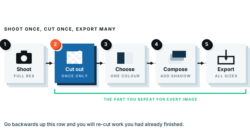
Here is where the photo becomes a listing image. Four steps, in order.
1. Remove the background
Even a good white card is never pure white, and it will have a shadow line at the bottom. Removing the background gives you a genuinely clean base.
Drop each photo into the white background maker and it separates the product and places it on true white. Our free preview processes the image inside your browser, so photos of products you have not launched yet stay on your machine.
If you want maximum flexibility, use the transparent background maker instead and save PNG masters. From a transparent master you can generate a white version, a coloured version, a banner and an ad, without reshooting anything.
Cut out your first product now →
2. Crop to a consistent square
Pick a canvas — 2048 × 2048 is the safe standard — and a margin, say 10% around the product. Apply the same margin to every item regardless of shape. Tall products and wide products will fill the frame differently, and that is correct: the margin is what stays constant, not the product size.
3. Adjust brightness and colour, lightly
Nudge exposure so white reads as white. Nudge saturation only if the colour is genuinely wrong. Resist the urge to make the product look better than it is — that is how you buy returns.
4. Export properly
- JPG, quality around 80, for the listing.
- Under 500 KB where possible. Page speed affects conversion.
- Filename = SKU or product name. Not IMG_4471.
- Keep the PNG master in an archive folder.
Part four: platform sizes
| Platform | Recommended size | Notes |
|---|---|---|
| Shopify | 2048 × 2048 square | Required for zoom |
| eBay | 1600 px longest side minimum | No borders, text or watermarks on the gallery image |
| Amazon | 1600 px minimum, product 85% of frame | Pure white required on the main image |
| Etsy | 2000 px shortest side | First image shows as 4:3 in search |
| Google Shopping | 800 px minimum | No promotional text or overlays |
| 1080 × 1080 | Crops to 4:5 in feed, so keep margin |
A realistic weekend plan
Saturday morning: set up by the window, shoot everything. Do not edit anything yet. Shooting and editing are different modes and switching between them halves your speed.
Saturday afternoon: rename every file by SKU. This is tedious and it is the step that saves you hours later.
Sunday: run the whole folder through background removal, crop to a common canvas, export both PNG masters and JPG listings.
Monday: upload, and write real alt text for each image.
Fifty products is genuinely achievable in a weekend once the setup stops moving.
Start with your worst listing
Do not redo the whole catalogue first. Take the product that gets views but no sales, reshoot it properly, and watch what happens over two weeks. That result will tell you exactly how much the rest of the catalogue is worth doing.
Frequently asked
Do I need a proper camera for product photos?
No. A phone from the last few years is enough for almost all e-commerce photography. Light and background matter far more than the camera.
How many photos should each product have?
Six to eight. One main shot on white, three or four angles, one detail, one scale reference and one in-use shot. More is fine; fewer than four costs you sales.
What background colour should product photos have?
Pure white for the main image on most platforms. Keep transparent PNG masters so you can place the product on any colour later without reshooting.
How do I stop my product photos looking yellow?
Turn off the room lights and shoot with daylight only. Mixing warm bulbs with cool daylight is the main cause of colour casts, and it is hard to fix afterwards.
What is the right image size for product listings?
2048 by 2048 pixels square is a safe standard that satisfies Shopify zoom and most marketplaces. Keep the file under about 500 KB for page speed.