Product photography
Choose The Best Background For Fashion Photography
How to pick a fashion backdrop: seamless paper, muslin, canvas or a plain wall, plus colour choice, spacing, and shooting once for shop and lookbook.
Whether you are shooting from a rail in your spare room or in a small hired studio, the backdrop is the decision that shapes everything else: your lighting, your space, your budget and how much editing you do afterwards.
This guide covers what a background is actually for, the real trade-offs between the main types, how to pick a colour against the garment, and the workflow that lets one shoot serve both your shop listings and your lookbook.
See a clothing shot on a new background in seconds → The preview runs in your browser, so unreleased collection images are never uploaded.
What is a fashion background actually for?
One job: to make the garment read.
Everything behind the clothes is competing for the viewer’s attention. A good background loses that competition on purpose. It gives the silhouette a clean edge, keeps the colour of the fabric honest, and adds nothing the eye has to work around.
That leads to three practical rules:
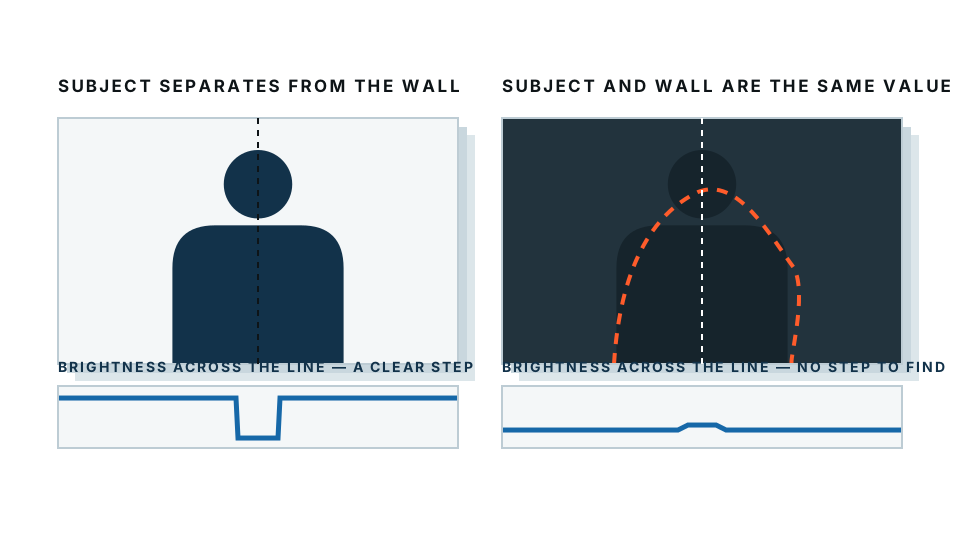
- Separation over decoration. The backdrop should differ in tone from the garment, so the outline stays crisp.
- Evenness over interest. Patchy light on a backdrop reads as a mistake, not as mood.
- Consistency over variety. A collection shot against six different backgrounds looks like six different brands.
Everything below follows from those three.
Which backdrop type should you buy?
| Type | Rough cost | Space needed | Durability | Best for |
|---|---|---|---|---|
| Seamless paper roll | Low to medium per roll | 3m+ depth, plus stands and a clear wall | Low. Tears, marks and creases; you cut off ruined sections | E-commerce, clean white and grey, repeatable sets |
| Muslin or fabric | Low | Similar depth, but stores in a bag | High. Washable, hard to destroy | Portable shoots, textured or mottled looks |
| Painted canvas | High | Same as fabric, but heavy | Very high. Lasts for years | Editorial, portraits, painterly campaign work |
| Plain painted wall | Almost nothing | A room with 2m+ of clear floor in front | Very high. Repaint when scuffed | Home rails, small studios, budget setups |
| On location | Free to permit costs | None of your own | N/A | Campaign and social content with atmosphere |
A few honest notes on that table.
Paper is the standard for a reason. A wide roll sweeps from the wall down to the floor with no join, so there is no line behind the model’s feet. It is also consumable — shoes mark it, and you tear off the ruined length and pull more down. Budget for that.
Fabric is the practical choice if you shoot in different places. Muslin creases, so it needs steaming or a deliberately mottled look where the texture is the point. It will not give you the flawless white that a marketplace listing wants.
Canvas is beautiful and expensive, and it is an editorial tool rather than a product one. It adds character, which is exactly what a shop listing does not want.
A plain wall is genuinely underrated. If you have a matte wall in a neutral colour and can put the model far enough in front of it, you have a working studio for the price of a tin of paint. The limit is depth: you need floor space in front of it.
On location is a different job. It is for making the clothes feel like part of a world, not for showing what they look like. Both matter, but do not expect one shoot to do both well.
How do you pick the backdrop colour?
Work from the garment outwards, not from the backdrop inwards.
- Light garments — white shirts, cream knitwear, pale linen — sit best on mid-grey. On white they lose their edges and the shape disappears.
- Dark garments — black tailoring, navy coats, deep denim — need a lighter backdrop. Black on charcoal is a silhouette with no detail.
- Mid-tone and saturated colours are the most forgiving. Grey works. So does a complementary colour, used carefully.
- Never match the backdrop to the clothes. A sage dress on a sage backdrop looks considered in your head and mushy in the camera.
If you can only buy one backdrop, buy mid-grey. It is far enough from both white and black to separate almost anything, it is neutral so it does not tint the fabric, and if you light it hard it goes near-white while lighting it less makes it read almost black. One roll, three looks.
Keep a black and a white as your next two purchases, in that order.
Try a different backdrop colour without reshooting →
How much space do you need behind the model?
More than people expect. This is where home setups usually go wrong.
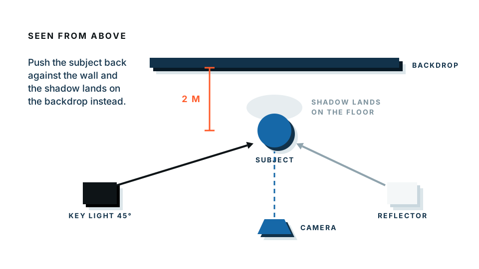
Put a model right up against a wall and two things happen: their shadow lands hard on the backdrop, and every crease and scuff in the surface is as sharp as the garment. Neither is fixable in editing.
Aim for at least 1.5 to 2 metres between the model and the backdrop, and more if the room allows. Then:
- Your key light hits the model, and the shadow falls behind them onto the floor rather than the wall.
- The backdrop drifts softly out of focus, which quietly hides its texture.
- You can light the background separately, so you control its brightness independently of the clothing.
You also need distance in the other direction. Stand well back and shoot at a longer focal length — around 85mm on a full-frame camera, or your phone’s telephoto lens — so the garment’s proportions stay true. Wide lenses close up distort both the body and the clothes.
White for shops, grey for lookbooks: how to serve both
Here is the tension every clothing brand runs into.
Marketplaces, shop pages and comparison feeds want plain white. It is often a listing requirement, and it makes a product grid look tidy and consistent. Lookbooks, campaign pages, Instagram and Pinterest want something with more life — grey, a colour, a texture, an environment. White looks sterile there.
Shooting the whole collection twice is not a realistic answer. The workflow that is:
- Shoot once on a clean, even neutral — mid-grey, well lit, model well forward of the backdrop.
- Cut out the garment and drop it onto pure white for every marketplace and shop listing.
- Use the same cutouts on grey, a brand colour or a scene for the lookbook, the email and social.
You shoot once. You get a consistent product grid and a lookbook that does not look like a catalogue, from the same files. When a marketplace changes its background rules, or your brand colour changes, you re-export rather than rebook a studio.
This is also why the tone rule earlier matters so much. Every later edit is easier when the original backdrop is clearly different in tone from the clothing. Shooting a white shirt on white is not just flat — it is genuinely hard to separate afterwards, because there is very little edge for anything, human or automatic, to find.
The genuinely hard cases
No automatic cutout handles everything, and it is better to plan around this than be surprised by it.
The hard cases in fashion are specific and predictable:
- Hair, especially loose, curly or flyaway hair against a similar tone.
- Fine lace and broderie, where the background shows through hundreds of small holes.
- Mesh, tulle and chiffon, which are semi-transparent, so there is no single right answer for what any given pixel should be.
- Anything shot against a low-contrast background, which turns a five-second job into a manual one.
You can make all of them easier at the shooting stage, and this is worth more than any editing skill:
- Put clear tonal distance between backdrop and garment.
- Light the background separately so it stays even and slightly brighter than you think you need.
- Tie or smooth hair when the shot allows it, and shoot a couple of frames with hair controlled as a safety net.
- Give sheer fabrics a plain, evenly lit backdrop so what shows through is one flat tone rather than a scene.
A quick note on privacy while you are working with unreleased pieces: our free preview processes the image entirely inside your browser, so nothing is uploaded. The paid full-resolution download is processed on our server, so if a shot is under embargo, use the preview to check your edges and decide from there.
The short version
- The backdrop’s job is to make the garment read, not to be interesting.
- Buy mid-grey first, then black, then white.
- Light garments on grey; dark garments on something lighter; never match the backdrop to the clothes.
- Leave 1.5 to 2 metres between model and backdrop.
- Shoot once on a clean neutral, then produce white for shops and grey or colour for lookbooks from the same files.
Frequently asked
What is the best backdrop colour for fashion photography?
Mid-grey, if you can only buy one. It sits between light and dark garments, so both read clearly against it, and it takes coloured light well if you want to change its tone later.
How far should a model stand from the backdrop?
At least 1.5 to 2 metres, and further if you can. Distance stops the model's shadow falling on the backdrop and lets it fall softly out of focus, which hides creases and texture.
Is seamless paper better than fabric for clothing shoots?
Paper gives a cleaner, more even surface with no creases, which suits e-commerce. Fabric is more portable and more durable but usually needs steaming. Paper tears and gets dirty; you cut off the ruined section and pull down more.
Should fashion photos be on a white background?
For marketplace and shop listings, yes — most platforms expect plain white. For lookbooks, campaigns and social, grey or a colour usually looks better. Shooting on a clean neutral and swapping the background later serves both from one shoot.
What backgrounds make cutouts difficult?
Anything close in tone to the garment, and anything busy. Hair, fine lace, mesh and chiffon are the genuinely hard cases for any automatic cutout, and they get much harder when the backdrop is a similar shade to the clothing.